MAIN
ART
GAMES
EXTRA
BLOG
MUSIC
MAIN
ART
GAMES
EXTRA
BLOG
MUSIC
⠀
Colors — Friday, May 15, 2026.
I received a crayon bubble gum today. Coincidentally, it was tinted with my favorite color.

I have 2 favorite colors. Coincidentally, they are exact opposites.
My favorite color number 1 is Mint. #56c0ae to be precise. I visualize it as a field with an infinitely-stretching plane as the ground and limitless cloudy skies. You have no restrictions on mint. It provides a safe space for our dwelling.
This might sound like completely demented autistic talk, but I'm not alone in my synesthetic ideas.
The Scottish electronic music duo, Boards of Canada, frequently connect their music with colors (Orange Romeda, ROYGBIV, and Turquoise Hexagon Sun are great examples). They feature mint on most of their album covers. Their songs are placed within the middle of an atmosphere similar to my perception of mint. Music Has the Right to Children (their debut studio album) includes what I consider to be one of the most mint-sounding songs ever, Triangles & Rhombuses.
(The short interlude at the end of the song is called, ironically, "It's Too Orangey").
The Designer's Dictionary of Color (which conveniently places Mint at page 164) describes it as follows:
Mint exists between light blue and light green. Mint is the younger sibling of green. It communicates growth, life, and the natural world. But it also conveys spring, youth, and beginnings. It is an especially pure color, maintaining a crisp and cool appearance. Mint is also delicate. It must be watched closely on press as it can shift to light blue or turquoise with too much or too little yellow. Due to the color differences on all monitors, mint will rarely display exactly as intended.
It's quite the low sacrifice, really.
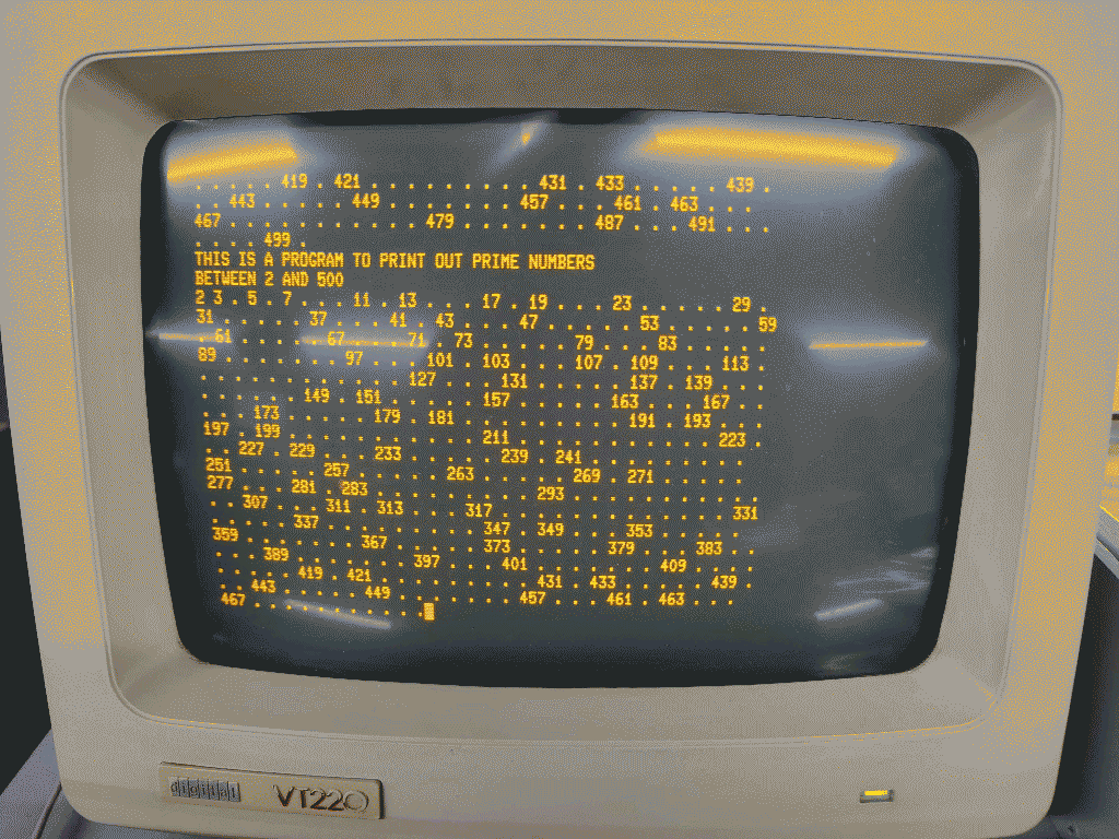
My favorite color number 2 is Orange (yeah, that's right). I could describe it using #ff9500, but I prefer to refer to it as the color of electrons colliding with P3 phosphor (you can actually map the emissions of this interaction to a certain wavelength, which in this case gives you a peak of 602nm. And then convert it to sRGB space which translates to #FF6A00, but that'd just ruin my description).
There are only two main Boards of Canada albums that use orange, Geogaddi, and the upcoming Inferno. I can only refer to Geogaddi (and the first two songs of Inferno) for the moment, but they are truly warmer, less affectionate, sinful, sinister ones.
The Designer's Dictionary of Color has this to say about orange:
Orange is one of the colors that are especially subjective. Orange is a combination of red and yellow. Living between these primary colors, one person may insist it is red; another may call it yellow. Orange has the positive attributes of heat, energy, youth, and happiness. It is related to summer sunsets and the color of flames in a fireplace.
Orange is used to create a sense of immediacy and spontaneity. Fast-food restaurants use orange in the interior to energize the customer and hasten their departure. Orange may be negatively seen as loud or annoying.
These 2 colors are enough to describe my dualistic states of mind. I could either be contemplating the infinite serenity of mint or collide with the unrighteousness of orange. None of them are my default state of mind. Therefore none of them can be my default favorite color.
I owe too much to Colorpedia (The Designer's Dictionary of Color as it is called in Spanish). According to my library's registry it was only one among fourteen other borrowings. Looking at this registry broke the illusion that I was (at least from 2025/03/06 to 2025/04/01) an avid library-book-hoarder, although I've definitely compensated for it with non-library texts.
Here is another excerpt from the Colorpedia I constantly think about:
Light Blue
Blue is the color of power. It can communicate mature military authority on one end of the spectrum, and juvenile innocence on the other. Light blue is connected to a sunny sky. It communicates ideas of peace and quiet, the spiritual and infinite. Like yellow, light blue is a good substitute for gray if the designer desires a more colorful solution.
Light blue is not cyan. Cyan is more intense and acidic. On the screen, cyan will appear fluorescent, while light blue remains consistent with the printed version. Light blue with too much yellow becomes mint green. With too much red, it appears lavender. A true light blue is calming and reassuring.
CULTURAL MEANINGS Light blue is connected to newborn baby boys in the West. White and light blue are the colors of Israel and are used for Chanukah decorations. The United Nations flag employs light blue to represent peace and serenity.